Designing Calmness for a digital presence
B2C • Web • Branding
Visitors who found Gabriel through Instagram didn't recognize him on his website. This disconnect killed their trust before a single conversation started.
We built a cohesive brand system covering the website, social media templates, pitch deck, and avatar. Everything grew from the same core identity.

Overview
Gabriel Leal is a mental health coach with a genuine following on Instagram. The problem? His website didn't match any of it. We weren't just iterating on a redesign; we did a full rebuild from scratch. The scope included his brand identity, website, social media system, pitch deck, and avatar.
Deliverables
Website Design
Brand Design
My role
Project Manager
Brand Designer
UX/UI Designer
Team
Pedro Santos - Visual Identity
Vinicius Rodrigues (me) - Website design
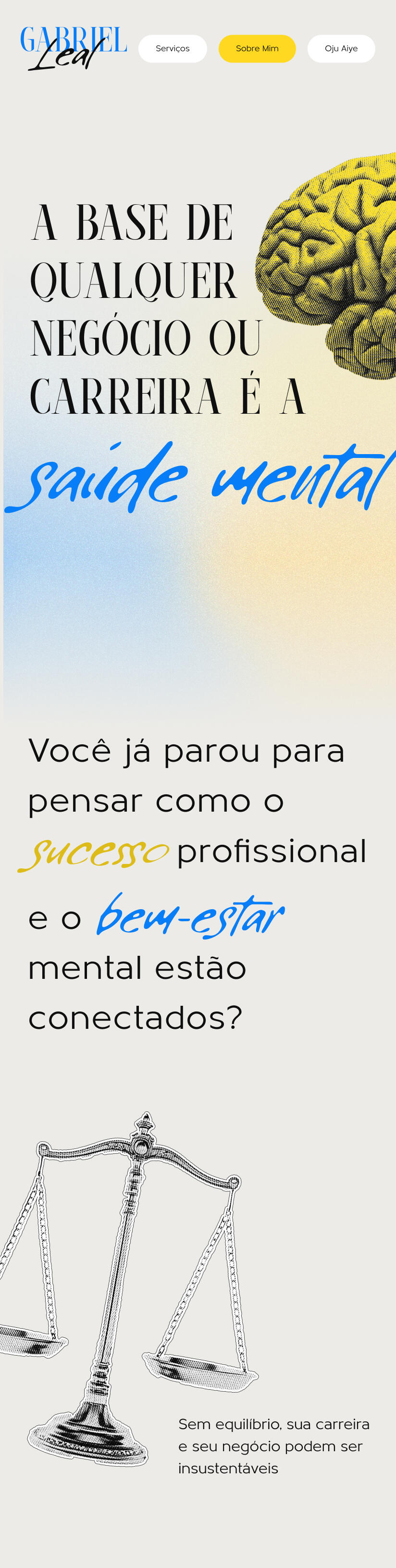

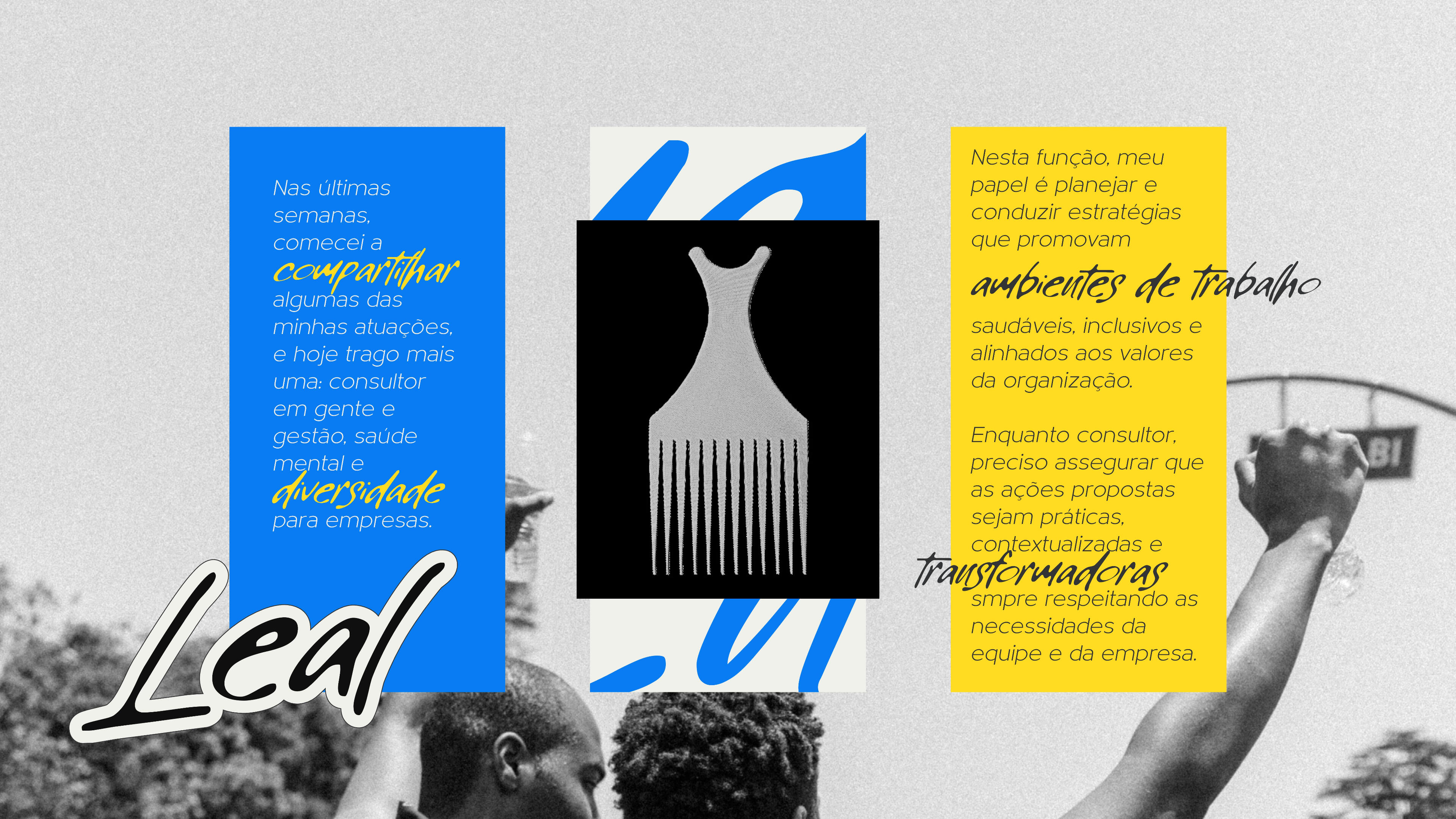
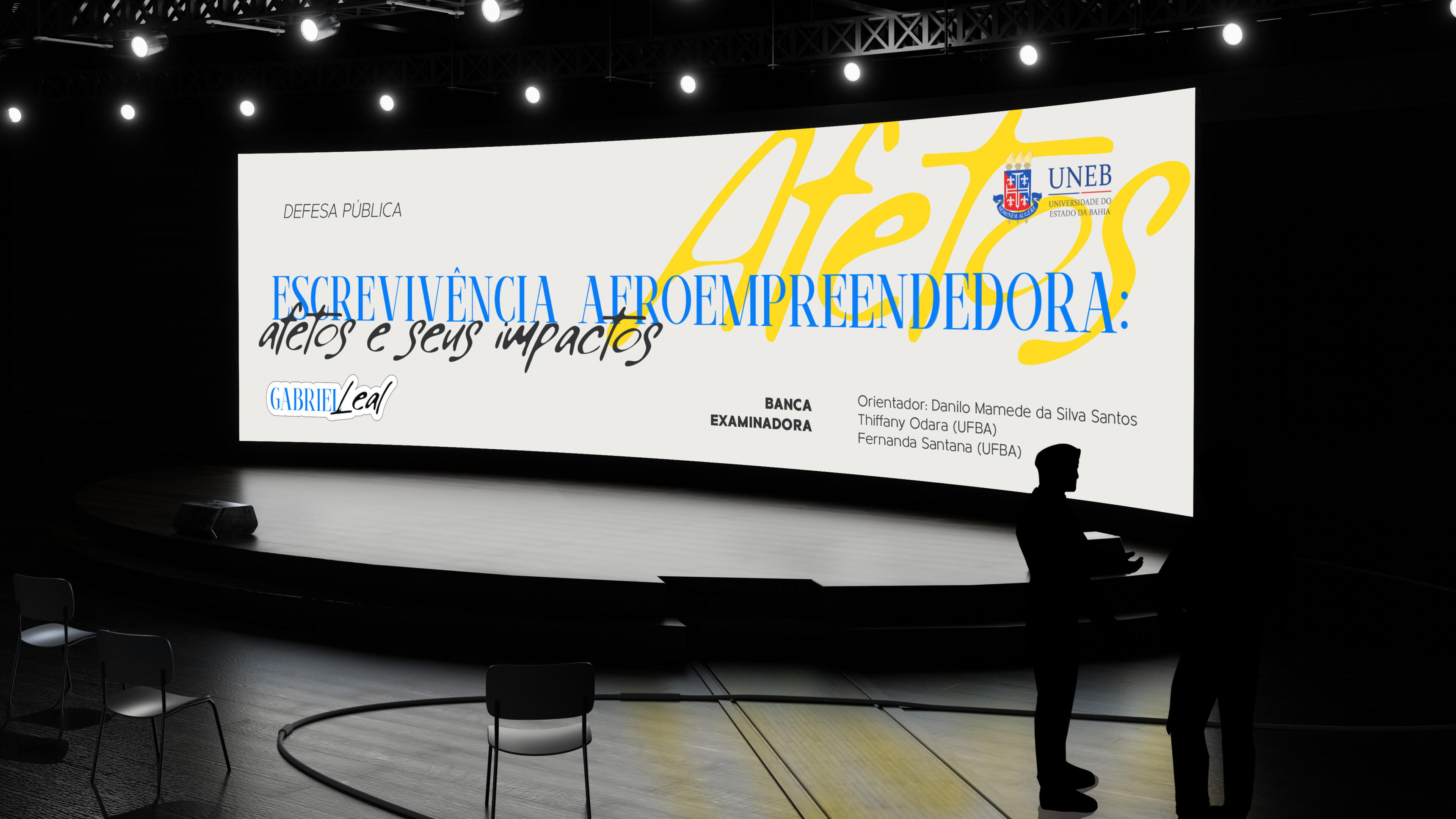
The Problem
He built the original site himself using a Wix template.
When potential clients searched for him after connecting on social media, they landed on something generic and transactional. It felt nothing like the empathetic person they'd been following online, creating a massive trust gap right at the most critical moment.
With this challenge in mind, we weighed 2 different solutions:
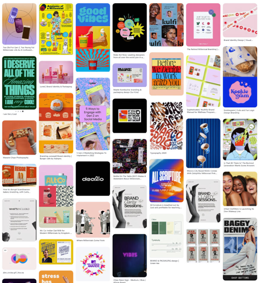
Option A
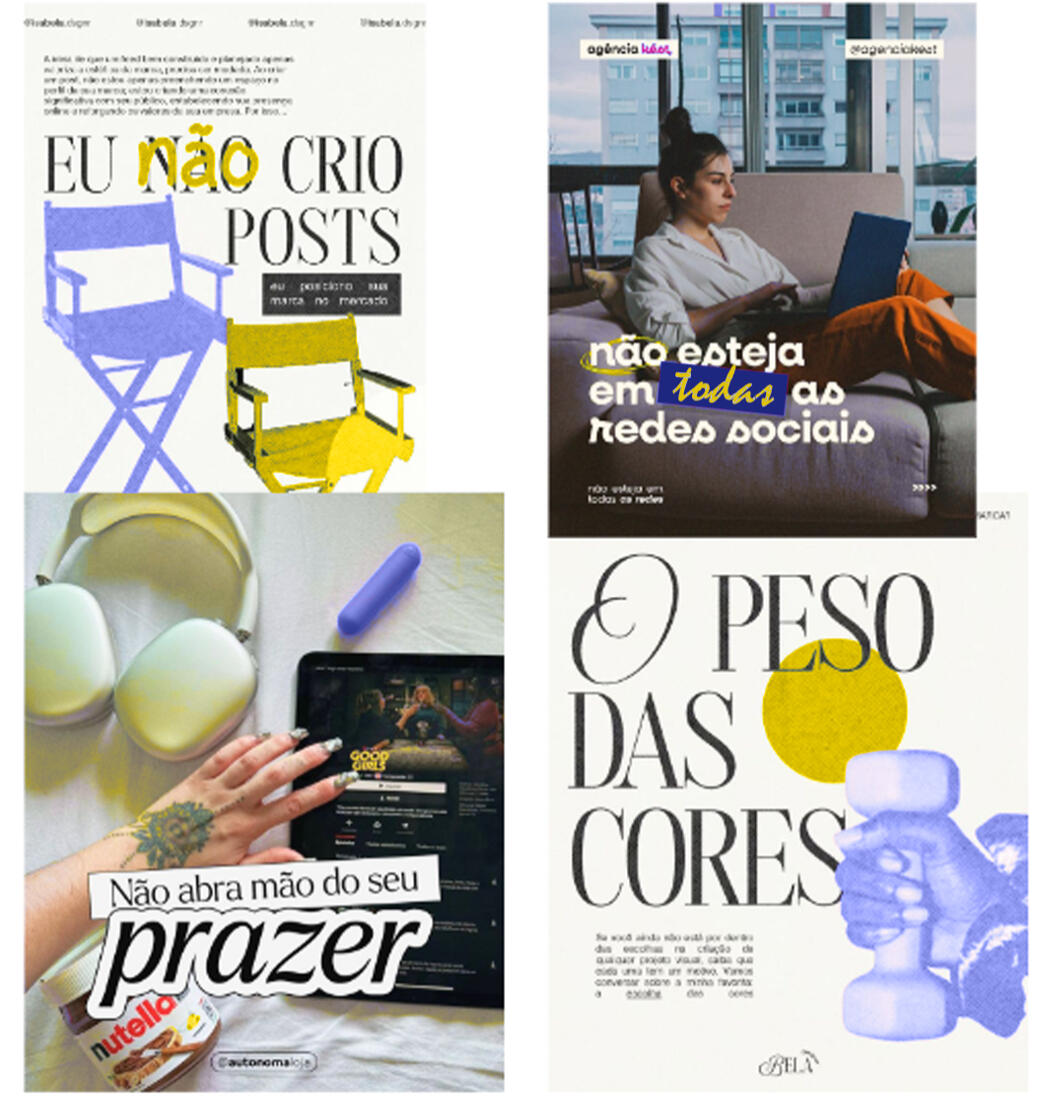
Lean into what other coaches were doing
Bold organic typography, hand-drawn elements, and urban lifestyle photos. It's energetic and familiar, but very crowded.
Option B (chosen)
Go the other direction
A clean modern layout with a restrained color palette and clear hierarchy. This approach feels confident and calm instead of expressive and noisy.
Why we chose Option B: The market was saturated with Option A. Standing out wasn't just a nice-to-have; it was the only way to make Gabriel memorable in a feed full of coaches shouting in the exact same voice. Calm was the loudest statement we could make.
Trade-offs: We sacrificed expressiveness. The brand doesn't feel artistic or handmade, so visitors associating wellness with organic textures might not immediately connect. We accepted that trade. Gabriel's audience values trust over aesthetics, and calm clarity was far more likely to earn that trust than busy visual energy.
Core brand pillars
Inclusivity, empathy, and approachability

Design process
Before setting our direction, I looked at what other coaches in the area were doing. Most used organic bold typography, urban lifestyle photos, and hand-drawn graphics. It felt energetic, but crowded.We decided to go the other way.Instead of fighting for attention with the exact same look, we chose clarity and calm. We grounded the brand in inclusivity, empathy, and approachability. We wanted it to look modern and confident without feeling cold.For the colors, we picked a calming blue and an energizing yellow. We wanted to stand out from the muted, earthy tones so common in the wellness space, while still keeping things grounded. The blue signals trust, and the yellow signals possibility. Put together, they reflect exactly what Gabriel's clients want.
Website Development
I built the website from scratch using our new brand system as the foundation. It couldn't just look good. It had to work as a digital business card that made a confident case for Gabriel before he even jumped on a call with a client.I structured every section to guide visitors toward a clear next step. Then, I added hover effects and scroll animations to bring the site to life without distracting from the message.Because Gabriel's audience spends most of their time online on Instagram, we made mobile a priority from day one. The layout adapts neatly across screen sizes. The buttons are touch-friendly, and the text stays readable even on the smallest screens.
Other deliverables
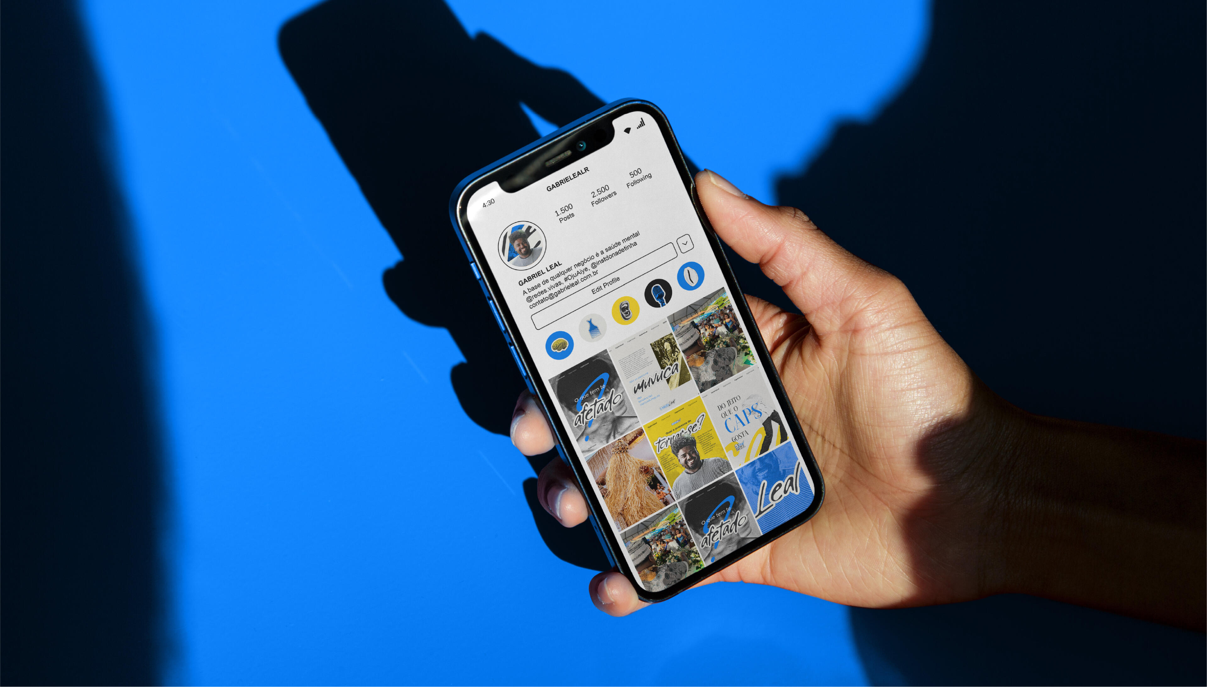
Beyond the website, we created a complete social media system, a pitch deck, and a custom avatar. We aligned everything to the same brand language. Now, every touchpoint a potential client has with Gabriel feels completely consistent.
Impact
+25% session duration
Visitors started spending more time engaging with the content. That was a clear signal we were reaching the right people in the right way.But the biggest win was a bit harder to measure. Gabriel finally had a digital presence that felt like him.
What I would do differently
- I'd run at least one round of 5-second tests before finalizing the homepage hero to validate whether the core message lands immediately.- I would set up event tracking from day one instead of relying purely on Google Analytics sessions. That would give us richer data on exactly what conversion actions people took, not just how long they stayed.